Before the 2016 presidential election cycle had even reached “lock her up” levels, Vanessa Otero, a patent attorney based in Denver, had already witnessed one political Twitter TWTR, +0.67% feud too many.
“I was alarmed that so many people, including people who were very intelligent in other areas, were sharing such polarizing, low-reliability news sources to argue with each other on social media,” she said. “I saw people losing relationships with friends and family essentially because of the news they watched and read.”
Instead of jumping into the fray, Otero decided years ago to do something about it and create a chart that would alert consumers to biases.
“A whole society can go from illiterate to literate in a generation or two — from media illiterate to media literate,” she said. “In a world where people are able to distinguish for themselves, there’ll just be a much smaller market for junk news.”
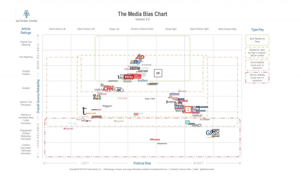
Here’s the latest iteration of the chart, which has been updated several times since it was introduced back in 2016 (click here for the interactive version):

“We have a big problem in our news-media landscape: too much junk news,” Otero said regarding her latest update. “Junk news is like junk food, and, just like junk food has caused massive health epidemics in our country, junk news is causing a massive polarization epidemic.”
Of course, in the process of attempting to educate and perhaps bring the temperature down, a whole new set of grievances is sure to emerge: Fox News isn’t that unreliable. Kick MSNBC further to the left! MarketWatch, balanced? InfoWars gets a bad wrap! CNN, seriously? Etc.
Share your well-informed, totally reasonable and completely unbiased opinions in the comments section below.


