


Over the past two weeks, the stock market has had some of its biggest drops since the 2008 financial crisis. Investors are asking whether this decline will turn into a 2008-like meltdown
I think that while the stock market could remain volatile for the next month, it will be the time to buy for those with a 12-month horizon.
Let’s start by looking to the same indicators that flashed red flags even before the coronavirus known as COVID-19 appeared.
My Jan. 18 article highlighted one very specific concern and the Risk/Reward Heat Map showed risk for January/February/March based on a broad composite of indicators.
Quantifiable barometer
Unlike COVID-19, the stock market is a quantifiable barometer of group think, a reflection of collective human emotion.
For example, there was enough fear to cause the S&P 500 index SPX, -2.50% to drop 10.7% from its closing record high on Feb. 19 through Thursday, and it’s plunging again Friday morning, Of course the Dow Jones Industrial Average DJIA, -1.98%, Nasdaq Composite COMP, -2.64% , and Russell 2000 RUT, -2.10% have been clobbered too.
We don’t know the exact cause of the fear, but it is quantified by the size of the drop. It stands to reason that similar drops in the past were caused by similar levels of fear (although the source of the fear is likely different). If we identify comparable past decline, we can project future performance based on past declines. Yes, history doesn’t repeat itself, but it provides us a potential road map.
Comparable declines
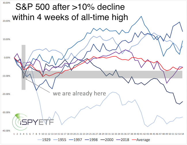
The S&P 500 never fell 12.9% the week after an all-time high, as it did the week of Feb, 24, but it dropped more than 10% within four weeks of an all-time high six other times. Let’s see how stocks fared thereafter.
The chart below graphs the forward performance of each instance (the shaded gray area marks the “we are here” level, which is after the 10% drop).
With the exception of the Great Depression (1929), all similar declines reversed almost immediately. Three and six months later each was up, again with the exception of 1929—an average of 10% after three months, and an average of 15% after six months.
Volatility spike
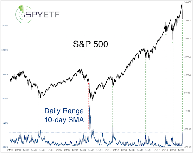
There are different ways to gauge volatility. The VIX VIX, +16.15% is one; actual price moves are another.
As mentioned in the Jan. 12 Profit Radar Report, the lack of volatility warned of a pullback. Now volatility spiked to 3.15% (10-day SMA of daily high-low), the highest level since 2011 … and 2008.
The dashed green lines indicate that a major S&P bottom was near every time volatility spiked that high … with one scary exception: 2008.
Since 1970, every time this setup happened, the S&P 500 was higher three and six months later (with the exception of 2008).
Like COVID-19, the mention of 2008 sends shivers down investors spines.
How big is the risk of this correction turning into a 2008-like meltdown?
Odds of 2008-like meltdown
The trajectory of the 2008 meltdown was very different, with the heart of the meltdown starting 11 months after the market peeked.
The chart below compares the worst of the 2008 meltdown (top panel, starting on Sept. 19, 2008) with the decline since the Feb. 19, 2020 high (bottom panel, left). The blue columns reflect the percentage of NYSE-traded stocks down for the day.
Clusters of 90% down days (where more than 90% of NYSE-traded stocks end the day in the red) have marked important lows from 2009 until recently.
Obviously, throughout 2008, there were multiple 90% down day clusters (red boxes and arrows). They didn’t necessarily end the bear market but still sparked multiday bounces of 11.9% or more.
Over the past nine days, there have been more down days of about 90% or more than in any other nine-day period (including 2008). How many sellers are left to drive stocks lower?
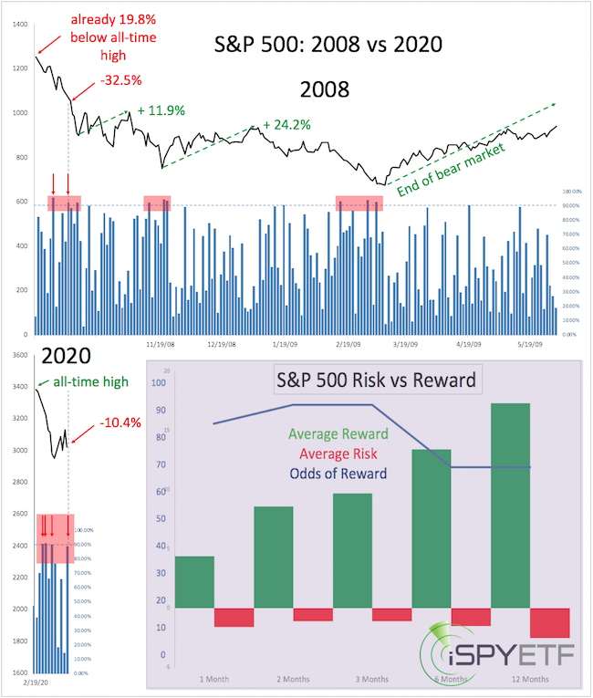
Persistent losses without at least a bounce of more than 10% would be highly unusual.
The Risk/Reward Heat Map mentioned earlier includes studies like the two mentioned above, where the odds of the S&P 500 trading higher in three and six months were above 80%.
In fact, since the Feb. 19 high, I’ve analyzed, calculated forward returns, and cataloged well over 20 studies. The purple chart inlay (chart above, right bottom panel) shows the projected reward (green bars), risk (red bars) and odds of reward (blue line) for the next one, two, three six and 12 months. The risk/reward for the next one to 12 months is very favorable, though the next one to four weeks — not shown — may continue to be volatile and see further losses.
The takeaway for investors with a longer time horizon is that the next one to four weeks are likely an opportunity to buy at a discount.
To mitigate the risk of experiencing a 2008-like meltdown (about 10%-20%), investors may opt to dollar-cost average (so buy in increments) into low-cost, broad based index ETFs like the SPDR S&P 500 Trust SPY, -2.51%, Dow Jones Industrial Average ETF DIA, -2.00%, Nasdaq Invesco QQQ Trust QQQ, -2.68%, and iShares Russell 2000 ETF IWM, -2.31%.
Simon Maierhofer is the founder of iSPYETF and publisher of the Profit Radar Report.