


January’s stock-market rally has seen U.S. equities hit record highs time and again, leaving the major benchmarks at lofty altitudes.
The Dow Jones Industrial Average DJIA, -0.26% has gained 2.2% so far in January, while the S&P 500 index SPX, -0.45% has advanced 2.9% and the Nasdaq Composite index COMP, -0.25% 4.8%, setting numerous record closes along the way. This has left many market watchers worried about equity valuations and wondering whether investors are in for a nasty correction.
Depending on your valuation measure, stocks are either approaching valuations last seen during the height of the dot-com bubble in 2000, or are reasonably priced relative to history, as the following charts will illustrate.
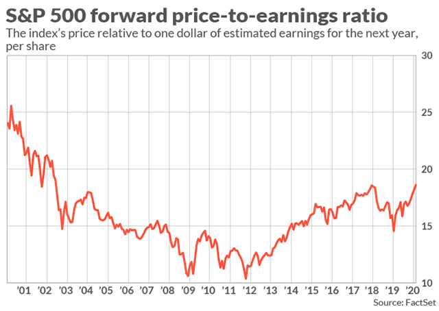
The price-to-earnings ratio sits around 18.5, well above the 5-year average of 16.7 and the 10-year average of 14.9, according to FactSet.
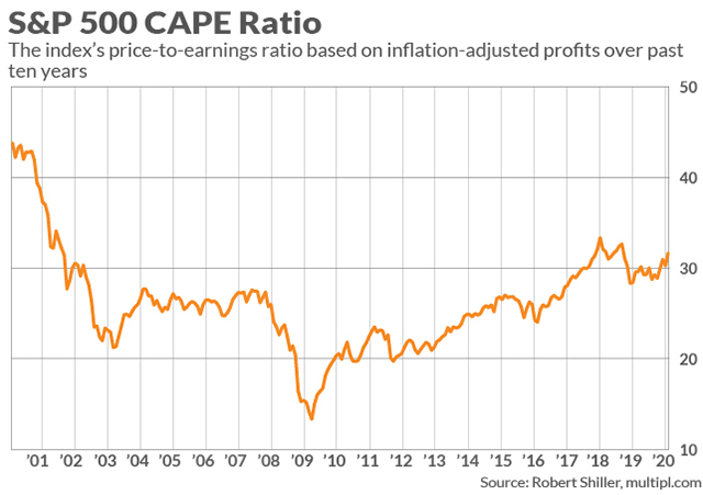
Professor Robert Shiller’s CAPE Ratio is at 31.8 times earnings, it’s highest level since the 2008 financial crisis apart from January 2018.
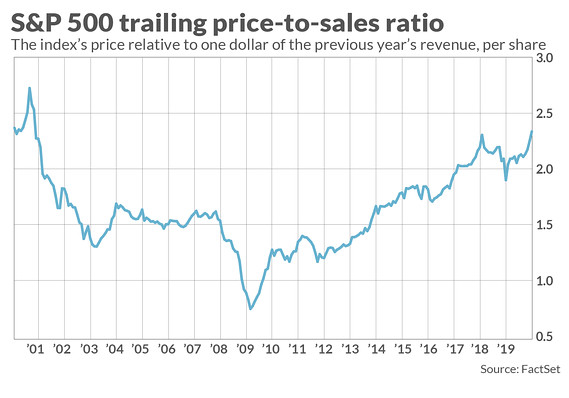
The price-to-sales ratio shows stocks at their priciest since the dot-com bubble. This measure shows an even higher valued stock market than price-to-earnings, because large U.S. companies have been boosting earnings-per-share through stock repurchases in recent years.
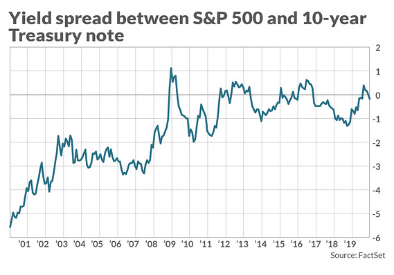
But stocks look much less pricey when you take into account the state of the bond market. Yields on risk-free U.S. government debt have remained at historically very low levels, and many analysts argue that one must take this into account when valuing the stock market, because bonds are the primary alternative to stocks.
As you can see from the chart above, the S&P 500 dividend yield is virtually identical to that of the 10-year U.S. Treasury note, when historically stocks yield roughly 20% less than risk-free bonds. If this relationship were to return to historical levels, it would argue for both higher stock prices and bond yields.
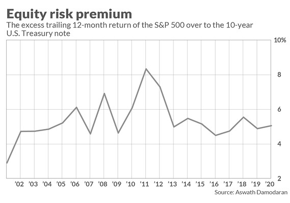
The equity risk premium, which also describes the relationship of the stock market to the bond market, argues that stocks remain a good investment. While it is below levels seen in the years following the financial crisis, investors are being compensated for equity risk at a higher rate today, 5.1%, than historical average of about 4.6%, according to Aswath Damodaran, professor of corporate finance and valuation at NYU’s Stern School of Business.